100% of the website you need
at a fraction of the cost.
Practice Right Websites leverage our decade+ of medical marketing experience to deliver unique medical practice websites that are high quality, affordable, and fast-to-market.
Unbelievably fast setup time.
Ever heard of a website launching in as little as two weeks? With our Practice Right Websites, the impossible just became possible.
Low up-front development costs.
Our code is already crafted and tested for multiple device types, saving you time and money on development.
Beautiful designs, customized to your practice.
Our Practice Right Website themes are designed, developed and tested by our award-winning web design team. Customized for you.
Content from experienced medical writers.
Our content strategists have written thousands of pages of high quality medical website content. Now they can write for you at just $200/page.
What Our Customers Say
“We have been working with Runner to build out a new website, and the whole process has been amazing! The entire team is easy to work with, they take and give feedback graciously, and make recommendations accordingly. The have been very transparent about everything throughout this whole process, which has made everything very easy! We look forward to a continued partnership with the Runner Agency!”
“RUNNER is a smart agency with experience in the healthcare industry – a pleasure to work with. They developed a website for us with a back-end lead management system, and continue to help us market our medical practice online and with social media.”
Steve R.
Practice Manager Oasis Orthopedic and Spine Integrated Services
“Oasis Orthopedic and Spine Integrated Services worked with Runner for ~ 5 years. They designed and built-out our website and helped integrate intake forms into our EHR, and worked with us on several other initiatives. From the beginning, we found Reagan, Lacy and their entire team professional, collaborative and helpful; in short, they helped us realize our goals. A special shoutout to Samantha, Shelby and Marc, who we worked most closely with over the past few years.”
Landan Luna
Director of Digital Marketing Encore Enterprises for Surepoint Emergency Centers
“Runner, our partner agency, has truly elevated our in-house team! They started strong with a comprehensive audit and have been an immense help in launching and optimizing campaigns. Working hand-in-hand with our internal stakeholders, they consistently deliver fantastic results. Sam, John, Marc, and the rest of the team have been delightful collaborators, and we’re excited for the bright future ahead.”
Chris Souder
Owner Anodyne Pain Management
“Fantastic team, very responsive and knowledgeable on practice marketing. Very happy with their website design and functionality as well as their CRM platform.”
Micah Driver
Mobile Wounds
“Reagan and the team at Runner are great. Easy to work with and they have a proven process to launch a website quickly – and with the right strategy to generate throughput. 10/10 recommend.”
We build websites for many fast-growing practices in the USA.
Our Websites are Packed with Advanced Features
Built to handle traffic from SEO, PPC, Email or SMS marketing, if you’re looking to build up your practice, our websites can be the foundation.
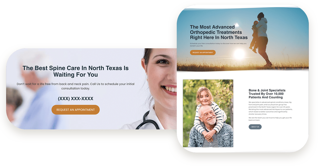
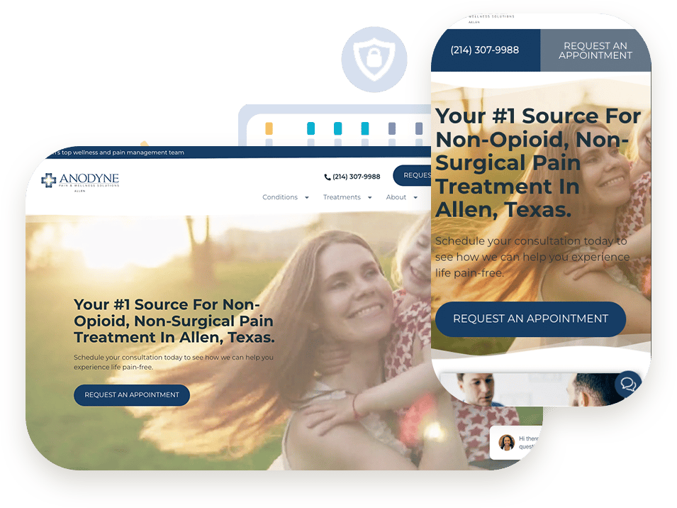
Built-in SEO. Optimized for all devices.
We built our Practice Right Websites for practices who need to be found by prospective patients near your practice. Localized keywords, smart meta data, relevant rich snippets, and snappy load speeds come built-into these fully responsive websites to give you maximum possible exposure to relevant search traffic.
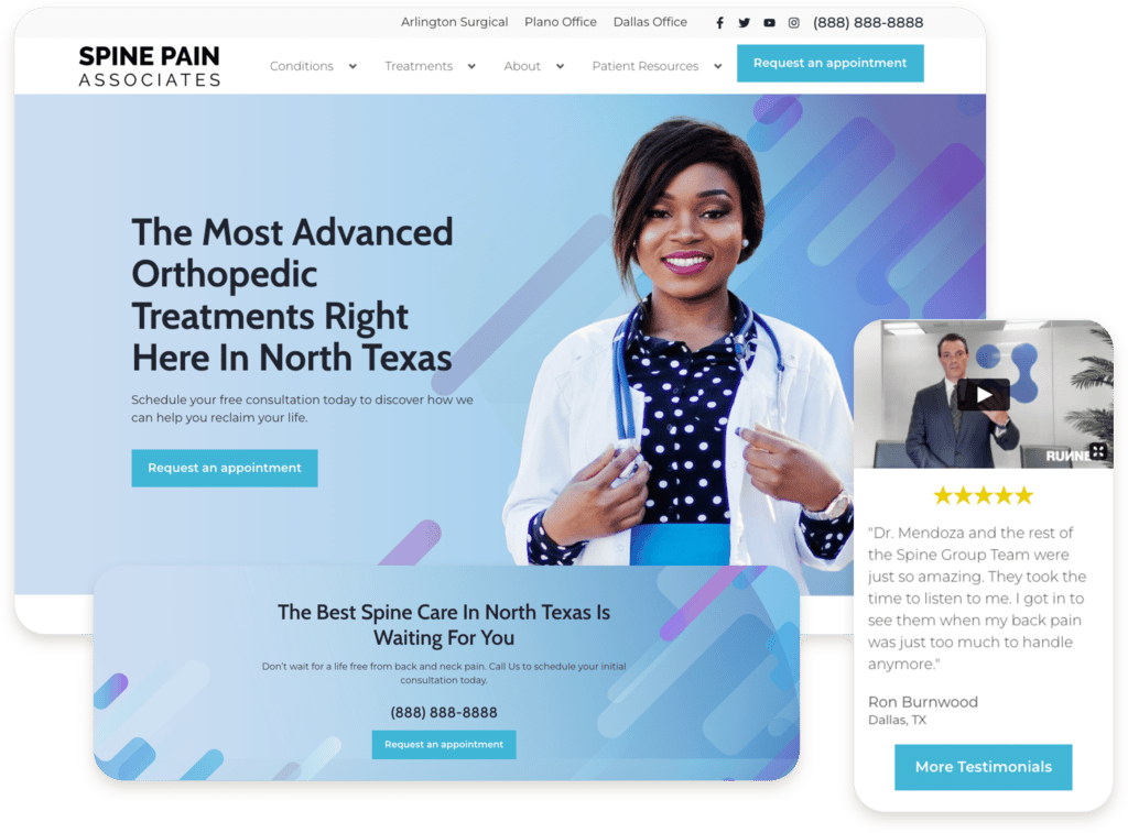
Unique, professional designs customized for your practice.
Our Practice Right Website themes are designed, developed and tested by our award-winning team.
You select a starting theme, and we customize it to your brand so it looks like it was created just for you.
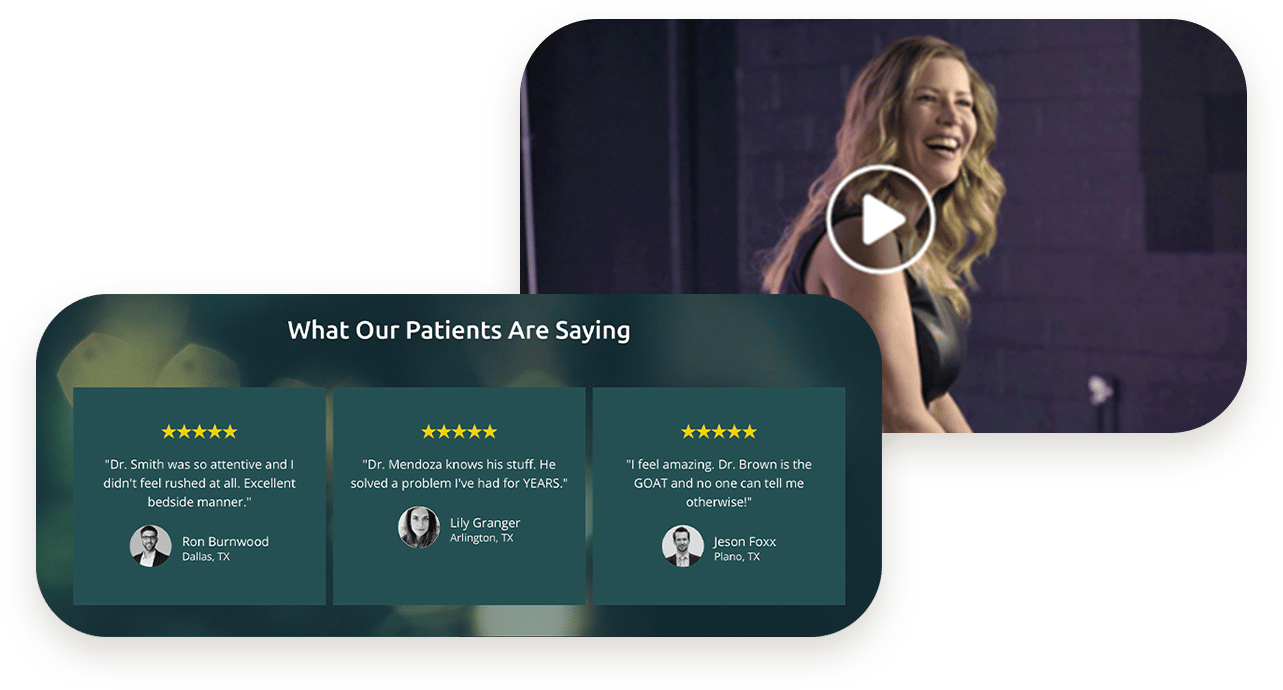
Display your best reviews front and center.
Automatically display only your best Google reviews across your website.
HIPAA-compliant forms & secure hosting included.
HIPAA compliance without the headache. Our forms connect to our HIPAA-compliant CRM for secure storage of prospective patient data.
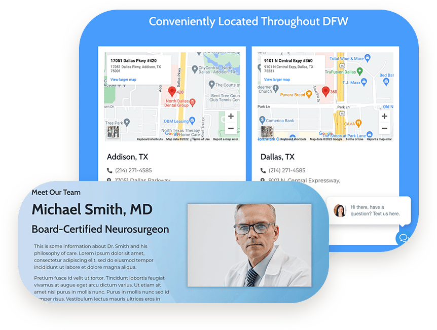
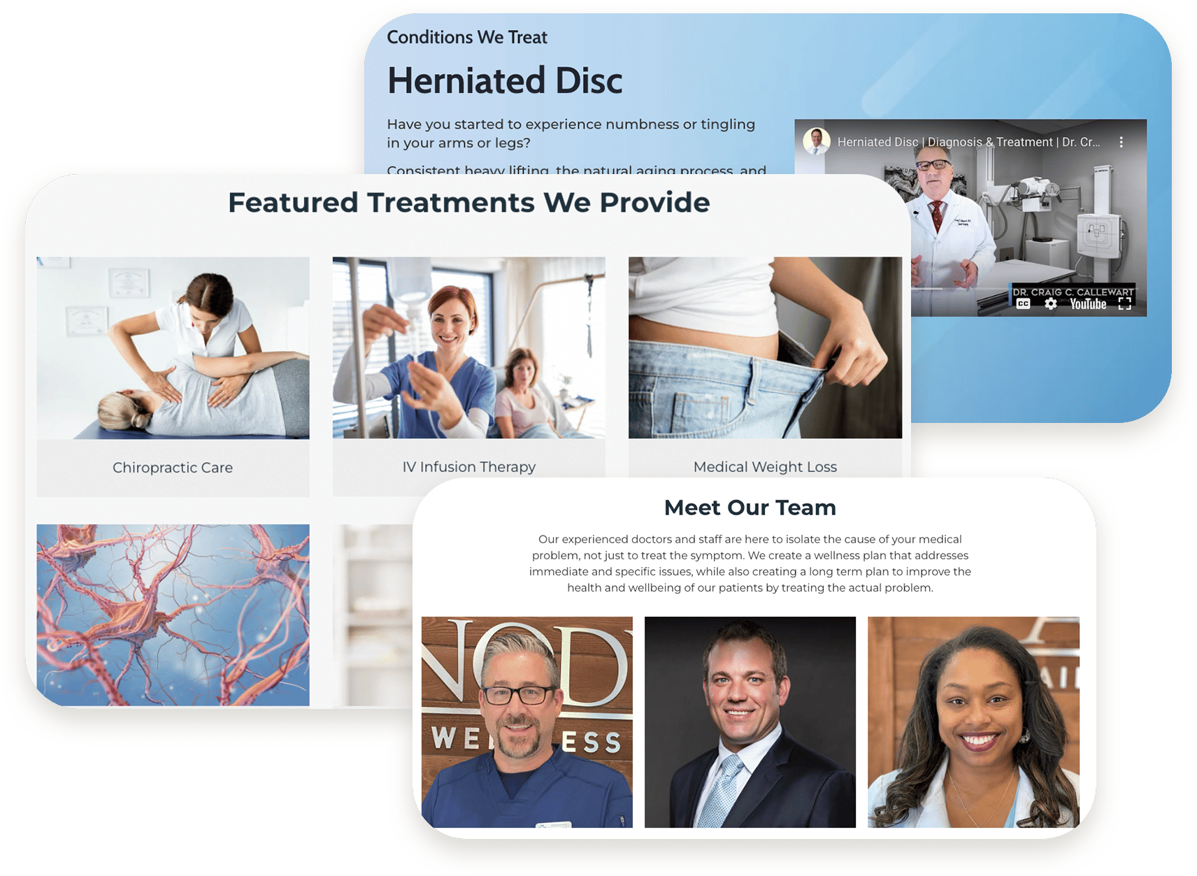
A website that grows with you.
Easily add locations, service pages, or providers as you grow over time with an intuitive interface that allows your team to add them, or we can help you.
And you get an experienced medical marketing partner.
Get a website crafted by a leading medical marketing and strategy agency with over 16 years of experience working with practices just like yours.
Our pros will maintain and secure your site, and when you’re ready to take your practice to the next level, we’re here for you.
Our websites are loaded with value.
You own the content and the domain
Connects to our Front Office Helper CRM
Optional Chat to SMS Widget increases new patient inquiries
1 hour of website maintenance per month included
Convert 2X more patients than industry average
Get Started with a Practice Right Website.
Let us show you how other practices are winning with Practice Right Websites.