You work hard to run your practice, and we think you deserve one that is more profitable, more efficient, and more stable.
RUNNER has a long history of proven results using leading-edge healthcare digital marketing strategies and tools to drive new patients to your practice.
Practice Right Websites
Get a top-notch website customized for your practice in as little as 2 weeks and for an unbelievably low price. It’s handmade by our team, fast-loading, search-optimized, and made specifically for practices like yours.
To achieve predictable patient flow quickly, you need to reach new patients through targeted advertising. Our medical practice advertising team will devise a strategy customized for your patient acquisition goals within paid search, social media, and more.
Turn your front office staff into a medical sales machine that never misses a new lead with our HIPAA-compliant all-in-one CRM, lead management, and messaging system built for medical practices like yours.
Optimize every corner of your most valuable local search asset and keep it fresh with regular content posts to increase visibility to your target patients.
Email & SMS Campaigns
Re-engage existing patients and stay top-of-mind with promotional marketing campaigns sent to your patients’ inboxes and phones.
Local Listings
Boost your online presence and local SEO instantly by optimizing over 100 of your local listings across the web. Even better than that, we do it for you.
Build your practice reputation, showcase the expertise of your doctors, and educate patients with high-quality videos directed by our video pros and filmed 100% remotely.
Connect with more patients and build your brand credibility on Facebook & Instagram with fresh, reliable content.
A partner for growth, not just a medical practice marketing agency.
We offer our clients a more tightly-coupled relationship than those other agencies. We use our 16+ years of medical marketing and patient acquisition experience to get in deep with your practice and affect your bottom line.
We’ve dedicated our digital marketing agency to helping medical practices. Our Practice Marketing Method™ was developed from over a decade of healthcare data, and is designed to deliver the services practices actually need to find more patients and maintain long-term practice growth.
Facebook Blueprint Certified Buyer
RUNNER is proud to have passed the rigorous exams from Facebook, showing our mastery of managing ads on Facebook and Instagram platforms.
Google Premier Partner Agency
We're proud to be in the top 11% of all Google advertisers in both performance and dollars managed on behalf of our clients.
We partner with LeadSquared to implement their very powerful hipaa-compliant CRM and marketing automation platform for medical practices.
Measurable Growth is 3 Steps Away
01.
Evaluate Your Practice
We want to hear about your past challenges, your current processes, and your future plans. Discuss every aspect of your business and set goals with a marketing expert (that’s us).
02.
Establish Your 90-Day Plan
Work with us to plan out the next quarter of marketing initiatives and gain new branding, messaging, and digital strategies to generate patient leads.
03.
Implement & Grow the Practice
As your digital presence improves and your internal processes streamline, you’ll experience the GROWTH your expertise deserves — without wasted resources of time or money.
What I get out of this patient acquisition program is consistency. I know where my patients are going to come from, I know how they’re going to come in, and they’re going to be worked up in a way that is easy for us to work through in clinic.”
Adam J. Bruggeman, MD, MHA
board-certified orthopedic surgeon & CEO
Texas Spine Care Center
Our Medical Marketing Specialties
We have deep experience in a wide variety of medical practice specialties. We tailor our marketing services to your unique industry and market, clinic locations and number of doctors.
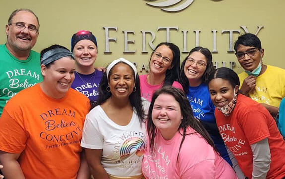
We provide marketing campaigns for IVF, surrogacy, and fertility clinics throughout the USA. Our team understands the empathy-driven strategies that can help your practice grow.
Grow your orthodontics practice with an improved strategy for new patient acquisition. If you want to reach more patients that need braces or aligners, our tactics are sure to make you smile.


